'Pen' Tool Secrets: Anchor Point Lettering Technique

In This Lesson...

  • When Illustrator automatically joins two paths
  • Why keeping paths separate is useful
  • An easy workaround for precision and separation

'Pen' Tool Quirks

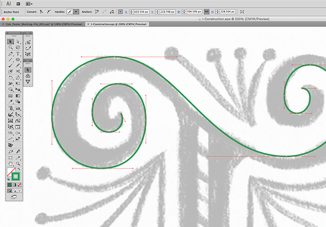
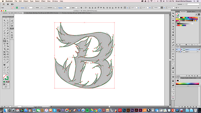
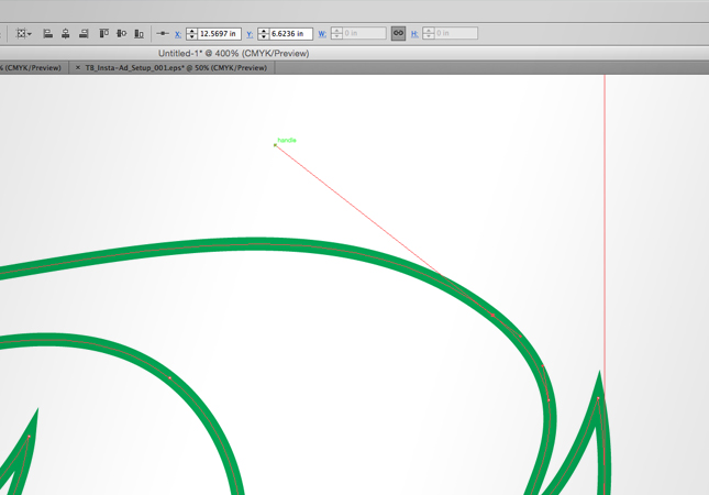
For all it's usefulness as a design tool, Adobe Illustrator still has some interesting little quirks that users must figure out how to work around. One of these quirks, involving the 'Pen' tool, used to drive me absolutely nuts. As I've detailed in previous posts I rarely vector trace using a continuous, point-by-point path that travels around the perimeter of a letterform. Instead, I prefer to construct letters in separate parts and combine with the 'Shape Builder' tool. But, working this way lead me to encounter the same problem over and over. Take a look...


Keep Paths Separate

See the problem? It's subtle but annoying. When using the 'Pen' tool to start a new path at the end anchor point of an existing path, Illustrator automatically joins the two. Quite often this is a useful feature, but there are times when keeping paths separate is highly beneficial for editing purposes and/or reusing segments of paths on similarly shaped letterforms. So, is there a work around? You bet!

Click. Space. Drag.


How did I do that? Unlike some workarounds, this technique is oh-so-easy: (You'll need to have Smart Guides turned on in order for this to work.)

  1. Using the 'Pen' tool, click the start of a new path near, but not on, the end anchor point of an existing path.
  2. Keep the mouse button pressed down.
  3. Press the Spacebar and drag the newly created point to the end anchor point of the existing path you wish to start from.
  4. Let go of the Spacebar and drag the Bezier Handles any direction you choose.

There you have it...a quick and easy way to achieve precision anchor point placement while maintaining two separate paths!

Next Time on Type Builder

Next time around, I'll introduce an obscure little tool for connecting paths. It might seem a bit strange, but for the vector lettering artist, it's a handy little gem packed with time-saving, accuracy-improving functionality.


InkScribe Part 2: Anchor Point Perfection

In the previous Type Builder I introduced the InkScribe plugin for Adobe Illustrator and hyped its incredible potential to become your next vector lettering super tool. In this lesson I'll take a closer look at the tool and answer the following questions:

  1. What exactly is the InkScribe plugin?
  2. What is the Smart Add/Remove Anchor Point (SARAP) feature?
  3. How do I personally use InkScribe and SARAP to help improve the speed and appearance of my vector lettering?

Plus, I'm going to include one super simple time saving tip to help make InkScribe an even more efficient tool. Here we go!

What exactly is the InkScribe plugin?

InkScribe is Astute Graphics' ambitious 'Pen' tool replacement plugin. The team at Astute Graphics sought to provide designers with a more intuitive drawing experience, so they packed InkScribe with all kinds of awesome, time shaving functionality. Don't believe me? Check out this sweet little promo page to see for yourself: InkScribe Features.

Before we go any further, I have a confession: I don't personally use InkScribe as the drawing tool it's intended to be. I happen to like the 'Pen' tool and feel that InkScribe's strengths lie in its abilities as a world class path editing tool. To be clear, I find InkScribe most useful after roughing in my trace with the 'Pen' tool (a bit more on this later). Regardless of how you choose to use it, InkScribe's $36 price tag (currently) makes it an absolute steal for the serious vector lettering artist.

What is the Smart Add/Remove Anchor Point (SARAP) feature?

One of InkScribe's many features, SARAP is a quick and easy way to both add and remove a path's anchor points, an ability that shines brightest on extra curvy paths. All ye who fear the letter 'S' and hand drawn scripts, REJOICE! By simply holding Alt and hovering over a selected path, SARAP can...

  1. Determine the best place to add key anchor points
    • Properly placed anchor points help to preserve the overall integrity of a curve when editing.
  2. Remove unnecessary or unwanted anchor points
    • Sometimes, problematic anchor points can make your path difficult to edit or visually unappealing.

The big takeaway here is that SARAP knows and shows you the best place for anchor points as they relate to the path you're attempting to draw.

How do I personally use InkScribe and SARAP to help improve the speed and appearance of my vector lettering?

Can InkScribe take the wheel and trace my hand lettering sketches to geometric and aesthetic perfection while I sit back and sip coffee?

Not exactly. Below, you'll find a video of me tracing an 'S' that shows just how useful this tool can be for vector lettering. As you watch, keep two things in mind...

  1. My use of the 'Pen' tool for the initial trace is super sloppy. I would NEVER recommend tracing like this, but as you'll see, InkScribe is totally up to the challenge.
  2. When I'm using InkScribe, all I'm doing is holding down Alt, clicking the mouse, and occasionally dragging the path to reposition. Nothing fancy here.


A Tiny Tip

Earlier in this lesson, I mentioned that InkScribe is intended to be a 'Pen' tool replacement, but I use it more as a path editor for my vector lettering. Admittedly, I could be called out for this (somewhat) bass ackwards approach considering that Astute Graphics actually has a powerful tool made specifically for path editing (called PathScribe), but sometimes tools prove useful in ways beyond their intended functionality. If you do decide to purchase InkScribe and use it in the way I've recommended, I have one tiny tip that will make your user experience easier: Create an Illustrator hotkey (mine is the number 1). This way, you can quickly shift between the 'Pen' tool (P), InkScribe (1), 'Direct Selection' tool (A), and so on.

Next Time on Type Builder

Check back soon as I'll be introducing a 'Pen' tool tip that is sure to solve an annoying lettering problem common to Adobe Illustrator.


Remove Serifs, Add Style

In This Lesson...

  • First add, then subtract
  • Serif considerations
  • Creating sans serif letters from serif style type

Reverse Method

Last week I presented a nifty way to add serifs to sans serif type. Well, this week I'll show a similar process, only we'll be subtracting serifs to create elegant, custom made, sans serif letterforms.

Be Careful!

Before I begin, a quick word of caution. Removing serifs is a trickier game than adding them. Type with serifs has been thoughtfully designed, so simply hacking serifs off without careful consideration is unlikely to end well. Think about the style/mood you're trying to achieve, and choose a typeface carefully. As always, don't be afraid to draw and edit a ton BEFORE moving on to your vector trace!

Chop n' Trim

The steps that follow are nearly identical to last week's lesson, but there are a few key differences to note along the way:

STEP 1: CHOOSE A SERIF TYPE STYLE

  • I've chosen a typeface called Big Caslon Medium because it's got a nice mix of thick and thin strokes and wide, sweeping serifs that should be somewhat challenging to remove.
  • After you choose a typeface, type a word in Illustrator (or any other graphics software), and set the color to a light/middle gray value.

STEP 2: PRINT

  • Print out a copy of your word on cheap, 8.5" x 11" paper.
  • If you have a light table and tracing paper, use 'em. If not, you can draw directly on top of your printout, but I'd recommend printing a few extra copies.

STEP 3: DRAW

  • Now for the fun part. Use the serif typeface you selected as the bones for your hand lettering, and experiment with removing and/or reshaping the serifs.
  • Remember, the type you selected is merely a skeleton at this point. Don't hesitate to redraw entire sections of a letter to fit the style you're trying to achieve.

STEP 4: SCAN

  • Scan or photograph your new, custom lettering and place it onto a locked layer in Adobe Illustrator.

STEP 5: TRACE & REFINE

  • Create a new layer and put your vector skills to work by tracing your sketch.
  • When you finish, you'll have designed custom, sans serif lettering that you can't find anywhere else!

Next Time on Type Builder

The 'InkScribe' tool from Astute Graphics is one of my absolute must have tools. Sure, I could find a way to get along without it, but it'd be a huge blow to my workflow. The reason? Find out next week in Part 1 of a two part series dedicated to one of the most useful tool features in all of Adobe Illustrator.


Drawing Custom Serifs on Sans Serif Letters

In This Lesson...

  • When originality is unoriginal
  • The inspiration of Frankentype
  • How to draw serifs on sans serif type

Mr. Originality

For the longest time, I was convinced that my custom type needed to be 100% original, wrought from the inner sanctum of my creative being. But after awhile, I noticed something: All of my hand lettering was beginning to have the same look and feel. The reason was simple: My feeble little mind can only create so much on it's own. At some point, like all artists, designers, and illustrators, I was going to have to access reference material to expand my horizon of possibilities and replenish my creative thinking abilities.

Frankentype!

Then, one day I had the thought, "What if I just Frankenstiened an existing typeface?" So, I typed a word in Helvetica, printed it out, taped the print to my LightTracer 2, slapped a piece of tracing paper on top, and went to town! When I finished, I was pleasantly surprised by what I'd drawn. My lettering had the bones of Helvetica, but the style, the flesh and blood, was an entirely original creation. Excitement!

Super Simple Sassy Serifs

In today's lesson, I'll provide a quick breakdown that explains how to add custom serifs to an everyday, sans serif typeface, and I think you'll be encouraged by the versatility this simple technique adds to your type game.

STEP 1: CHOOSE A SANS SERIF TYPEFACE

  • I've chosen the typeface DIN Condensed Bold for its height, weight, and clean/modern construction.
  • After you choose a typeface, type a word in Illustrator (or any other graphics software), and set the color to a light/middle gray value.

STEP 2: PRINT

  • Print out a copy of your word on cheap, 8.5" x 11" paper.
  • If you have a light table and tracing paper, use 'em. If not, you can draw directly on top of your printout, but I'd recommend printing a few extra copies.

STEP 3: DRAW

  • Now for the fun part. Use the sans serif typeface you selected as the bones for your hand lettering, and experiment with all kinds of fancy schmancy serif styles.

STEP 4: SCAN

  • Scan or photograph your new, custom lettering and place it onto a locked layer in Adobe Illustrator.

STEP 5: TRACE & REFINE

  • Create a new layer and put your vector skills to work by tracing your sketch.
  • When you finish, you'll have successfully performed type surgery and created custom, serif lettering that you can't find anywhere else!

Next Time on Type Builder

This week I showed you how to draw super simple sassy serifs onto an existing sans serif typeface. Next week, I'm headed in reverse, as in removing serifs to create to a funky sans serif type specimen!


Letter Better with Illustrator's 'Width' Tool

In This Lesson...

  • The 'Outline' method of vector tracing
  • Is there a faster way to trace ornate letterforms?
  • Using Adobe Illustrator's 'Width' tool

Tried & True

Most of the time, vector tracing your hand lettering looks something like this during the construction phase:

The way I vector trace may be a bit different from the way you do it, but I'm willing to bet that both of our methods are based on tracing around the perimeter of a letterform. This is a tried and true method, the best practice, and it works for just about any letter style you could hope to create. However, it isn't the only method, and since the goal of Type Builder is "Clean Letters. Fast Vectors." I'd like to share a sweet little timesaver that may just revolutionize the way you vector trace your hand lettering in Adobe Illustrator.

Width Magic

Let's say this fancy schmancy "I" is one of your sketches. Sure, it was fun to draw, but when you open Illustrator, you feel a twinge of regret because you know that ornate letters like this can be a bear to trace.

Enter the 'Width' tool. As one of Illustrator's standard offerings, the 'Width' tool is super handy and should be a regular part of the lettering artist's vector arsenal. Allow me to show you why.

With your fancy sketch on a locked layer at 30% opacity in Illustrator, use the 'Pen' tool to trace along the top arm of the "I".

Here's where things get cool! Instead of tracing the bottom edge of the arm, you can use the 'Width' tool to do this:


Magnifique! The 'Width' tool gives you the ability to add shape to any path with a simple click and drag of the mouse.

(Note: To add width to both sides of a path uniformly, simply click and drag on the width point. To add width to one side of a path, hold down the 'Alt' key while dragging on the width point.)

Up Your Game

When it comes to vector tracing your hand lettering in Adobe Illustrator, the 'Width' tool opens up a ton of possibilities. Like any tool, it has it's limitations (especially as paths widen and curve tolerances tighten), so you'll need to take time to experiment and learn its nuances. Overall, the 'Width' tool is a huge timesaver, easy to use, and helps ensure clean, consistent stroke widths in complex letterforms. Give it a try!

Next Time on Type Builder

On the next Type Builder, I'll share a simple tool that's bound to expand your sense of what's possible when it comes to hand drawing letters on the fly in Adobe Illustrator.

PS...Sign up below to have Type Builder delivered directly to your inbox!


Draw Organic Letters Using Illustrator's Pencil Tool

In This Lesson...

  • A way to break free from Illustrator's 'Pen' tool
  • The organic possibilities of Illustrator's 'Pencil' tool
  • A step-by-step approach to using the 'Pencil' tool for clean, flowing letterforms

Vector Naturalist

So, you just drew this super organic letterform. It's all flowy and curvy and intricately detailed, and now you're wondering, "How do I vector this thing? Do I seriously have to endure the tedium of the 'Pen' tool's point-by-point precision? What's the point of creative spontaneity if I have to be confined to the geometric limits of bezier handles?!?"

Take heart, embattled letterer! There's another way, a more natural, hands-on way. Behold, the 'Pencil' tool. One of Illustrator's unsung heros, the 'Pencil' tool provides hand lettering artists with a way to trace organic letterforms that's as easy as using...a pencil.

Here's how it works (Note: This method works best if you're using a drawing tablet like an Intuos.)

DRAW

  • Draw up any letter, using any organic style you like.

SCAN

  • Now scan or photograph that drawing, and drop it into a locked layer in Adobe Illustrator.

TOOL SETTINGS

  • Double click the 'Pencil' tool to bring up its settings box. There are a few different levels of control, and the options you select really do have an impact on line quality and workflow. Experiment to find the settings that work best for you and the letter you're tracing. Here's a screenshot of the settings I use most frequently:

PATH STYLE SETTINGS

  • Feel free to use the path style, color, and thickness you prefer. I typically use the 'Pencil' tool as a means of shape creation, so I keep these settings simple:

TRACE

  • Now that you're all set up, use your stylus to trace your letterform as accurately as you can. Go ahead and let paths intersect, and don't worry if the trace starts to look a little messy. You'll clean it up a bit later.

MERGE

  • Highlight all the paths you created, and use the 'Shape Builder' tool to merge your letterform into a shape. Then, hide the shape, and delete any leftover segments.
  • 'Hide' Object Shortcut: Cmd-3 (Mac) or Ctrl-3 (PC)
  • 'Unhide' Object Shortcut: Cmd-Alt-3 (Mac) or Ctrl-Alt-3 (PC)

REFINE

  • Just like with the 'Pen' tool, you may want to tweak and adjust your new shape until it looks the way you intend.

Bingo Bango!

You just achieved a clean, beautiful letterform with flowing, organic appeal, and you did so completely free of the 'Pen' tool's iron grip!

Next Time on Type Builder

Just like you, I'm always learning new things about making letters. Recently, I started experimenting with Adobe Illustrator's 'Width' tool, and I couldn't be more excited to share the lettering possibilities it's opened up. Check back next week to learn a few basic tips that may change your entire approach to vector lettering!

PS...Sign up below to have Type Builder delivered directly to your inbox!


Extend and Trim Illustrator Paths with Ease

In This Lesson...

  • A better way to extend and trim vector paths in Adobe Illustrator
  • Capabilities of the 'Path Extend' tool
  • Using the 'Path Extend' tool for vector lettering
  • Thoughts on investing in tools

My Favorite Plugin

Let's get right to the point. When you're vector tracing hand lettering in Adobe Illustrator, there will come a time when you'll need to make a path you've drawn shorter or longer. Traditionally, this would be a task for the 'Pen' tool, but there's a highly effective alternative available.

Last time on Type Builder, I introduced Astute Graphics (AG) plugins for Adobe Illustrator and went on and on about how good they are. Well, my feelings haven't changed, and I'm genuinely excited to introduce AG's 'Path Extend' tool. Easily my favorite feature of the AG VectorScribe v2 plugin set, the 'Path Extend' tool is feature packed and the perfect addition to your vector lettering toolbox.

Features Galore!

So, what exactly is the 'Path Extend' tool capable of?

  • Lengthening paths using one of four extension modes:
    1. Single Bezier
    2. Constant Radius
    3. Straight
    4. Spiral with Winding Constant
  • Shortening paths
  • Trimming paths to points of intersection with other paths or guides
  • Reversing the curvature of a path
  • Lengthening or shortening paths based on specific distances

Additionally, the 'Path Extend' tool has an easy-to-use control panel that allows for tweaking all kinds of variables.

Lettering & The 'Path Extend' Tool

Now that I've introduced the 'Path Extend' tool, I'd like to share five practical ways that I use it to help vector trace my hand lettering in Illustrator:

  1. Visualizing and reshaping paths along more natural, geometrically sound curves
    • This becomes particularly useful when the curves in your reference sketch aren't quite right (flat, skewed, too round, etc).
  2. Quickly adding or subtracting long path segments with precision
  3. Closing small gaps before using the 'Shape Builder' tool
  4. Adding detail and flourishes using the 'Spiral' extension option
  5. Freestyling new, undrawn curves with confidence

Check out this quick video to see the 'Path Extend' tool in action.


A Word on Cost

It's worth mentioning that Astute Graphics plugins aren't cheap. They're high end vector drawing tools, and acquiring them is an investment. With time and practice, the return on your investment will mirror the Type Builder motto, "Clean Letters. Fast Vectors." When you work clean and fast, you stand to profit from your vector lettering abilities. If you're on the fence, I recommend you...

  • Browse the Astute Graphics website for more information
  • Download the 14-day free trial and try the plugins for yourself
  • Leave a question for me in the 'Comments' section below

Next Time on Type Builder

On the next TypeBuilder, I'll review another nifty Astute Graphics tool that helps smooth out rough spots in curves and remove excessive anchor points (which can make editing paths a nightmare).

PS...Sign up below to have Type Builder delivered directly to your inbox!


How I Ease The Aches of Hand Lettering

Ominous Disclaimer: I'm not a healthcare professional in any way...just a guy that makes letters, logos, and drawings. The following Type Builder post isn't medical advice. In fact, it's not advice at all. It's just me sharing something I do to help ease the aches and pains of vector lettering. Use at your own discretion.

In This Lesson...

  • The aches and pains of physical inactivity
  • Thoughtful consideration
  • A quick and easy movement circuit

Achy Breaky

Design is a profession, and it is a passion, and I love that I get to wake up each day and dive into projects that are both challenging and fulfilling. However, working on a computer every day, day after day, has a way of making my eyes, neck, back, shoulders, hands and hips super sore. When I get stiff and sore, I also get grumpy, and my creative and technical abilities suffer.

To combat the effects of peering into my monitor for hours at a time, I've created a series of easy-to-perform movement circuits that get my blood flowing, help me refocus, and renew my creative energy. Today, I'd like to share one of these circuits. It takes about 5 minutes to complete.

Pause & Consider

Before starting, there are a few things I always try to stop and think about:

  • Breath - When I do this circuit, I heed my inner Bryan Kest and focus on deep and steady nose breathing throughout. If I get winded, I back off and simply focus on my breath.
  • Stability - Depending on the movement, I sometimes use a chair, wall, or table to help me balance.
  • Pain - If a movement causes me pain, I stop doing it and move on to another. Or I focus on breathing.

Type Builder Movement Circuit

(Unfortunately, the TypeBuilder budget isn't hefty enough to hire a fitness model. Here's a bearded guy wearing stretch jeans and a Carhartt vest instead.)

1. Stand and stretch to sky (15 reps)

2. Single leg knee raise (10 reps on each leg)

3. Side-to-side stepping (20 reps)

4. Fist squeeze curls (15 reps)

5. Modified airplane (20 reps)

6. Single leg kick (10 reps on each leg)

7. Heel pointers (15 reps on each heel)

Vector tracing hand lettering in Adobe Illustrator requires deep mental focus but very little physical activity. I'm always surprised at how creaky my body gets from simply sitting and clicking a mouse, but I've found that routinely getting up from my desk to work through some basic movements is a great way to break up an intense trace session and reinvigorate both mind and body.

Next Time on Type Builder

Fancy tools don't develop skills (only practice does that), but having the right tools and knowing how to use them can greatly increase your confidence and efficiency. On the next Type Builder, I'll introduce a company whose tools helped take my Adobe Illustrator capabilities to another level. 

PS...Sign up below to have Type Builder delivered directly to your inbox!