In This Lesson...
- The 'Outline' method of vector tracing
- Is there a faster way to trace ornate letterforms?
- Using Adobe Illustrator's 'Width' tool
Tried & True
Most of the time, vector tracing your hand lettering looks something like this during the construction phase:

The way I vector trace may be a bit different from the way you do it, but I'm willing to bet that both of our methods are based on tracing around the perimeter of a letterform. This is a tried and true method, the best practice, and it works for just about any letter style you could hope to create. However, it isn't the only method, and since the goal of Type Builder is "Clean Letters. Fast Vectors." I'd like to share a sweet little timesaver that may just revolutionize the way you vector trace your hand lettering in Adobe Illustrator.
Width Magic
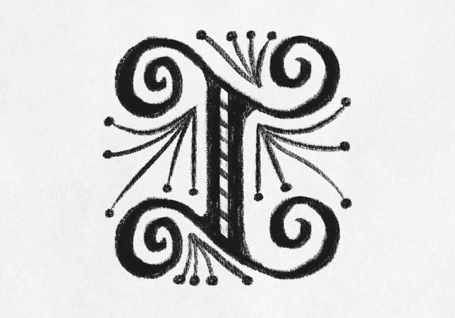
Let's say this fancy schmancy "I" is one of your sketches. Sure, it was fun to draw, but when you open Illustrator, you feel a twinge of regret because you know that ornate letters like this can be a bear to trace.
Enter the 'Width' tool. As one of Illustrator's standard offerings, the 'Width' tool is super handy and should be a regular part of the lettering artist's vector arsenal. Allow me to show you why.
With your fancy sketch on a locked layer at 30% opacity in Illustrator, use the 'Pen' tool to trace along the top arm of the "I".
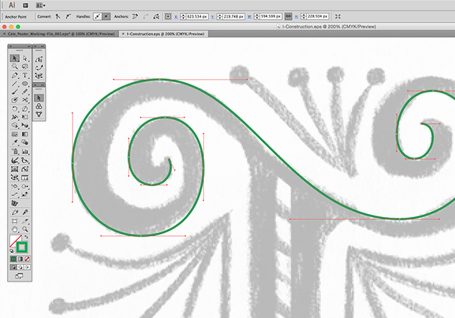
Here's where things get cool! Instead of tracing the bottom edge of the arm, you can use the 'Width' tool to do this:
Magnifique! The 'Width' tool gives you the ability to add shape to any path with a simple click and drag of the mouse.
(Note: To add width to both sides of a path uniformly, simply click and drag on the width point. To add width to one side of a path, hold down the 'Alt' key while dragging on the width point.)
Up Your Game
When it comes to vector tracing your hand lettering in Adobe Illustrator, the 'Width' tool opens up a ton of possibilities. Like any tool, it has it's limitations (especially as paths widen and curve tolerances tighten), so you'll need to take time to experiment and learn its nuances. Overall, the 'Width' tool is a huge timesaver, easy to use, and helps ensure clean, consistent stroke widths in complex letterforms. Give it a try!
Next Time on Type Builder
On the next Type Builder, I'll share a simple tool that's bound to expand your sense of what's possible when it comes to hand drawing letters on the fly in Adobe Illustrator.
PS...Sign up below to have Type Builder delivered directly to your inbox!
