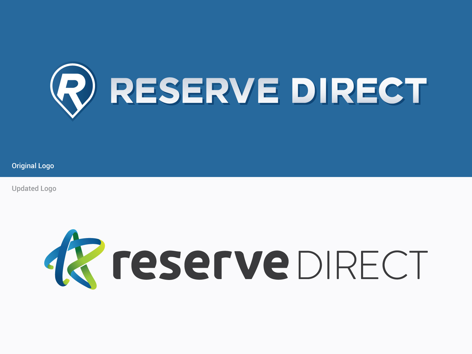
Reserve Direct Logotype
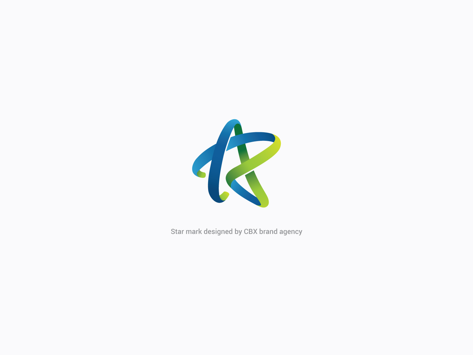
Reserve Direct is an online travel company that I connected with through Toptal, a web-based network of freelance designers and developers. During our first meeting, I discovered that Reserve Direct's President (John) and Marketing Director (Kevin) had been engaged in a year long rebrand under the guidance of CBX, a brand agency located in New York City. The result of this process was a laser focused brand positioning document and a playful star mark to represent Reserve Direct's standard of excellence as a trusted source of online travel information and trip planning resources.
When I entered the picture, John and Kevin were looking to complement the star mark with a versatile logotype system that could incorporate several destination cities. I got things rolling with a round of sketches exploring a wide array of custom type styles, and the project took off from there.
Refined Hierarchy
One of the main problems John and Kevin identified in the original logo was that the mark and logotype blended together for a less than memorable brand impression. Right off the bat, I recommended that the updated logo have a clear hierarchy, even if that meant de-emphasizing some parts in favor of others. In this way each part takes on its own visual weight and becomes easier for our eyes to process.
Complementary Type
It's not often that I start a design project with a key visual element already in place, but such was the case with the star mark when I took on this job. John and Kevin really liked the energy of the mark, and together we decided that the logotype should have its own complementary character that wouldn't compete with the star's whimsy.
Frankentyping
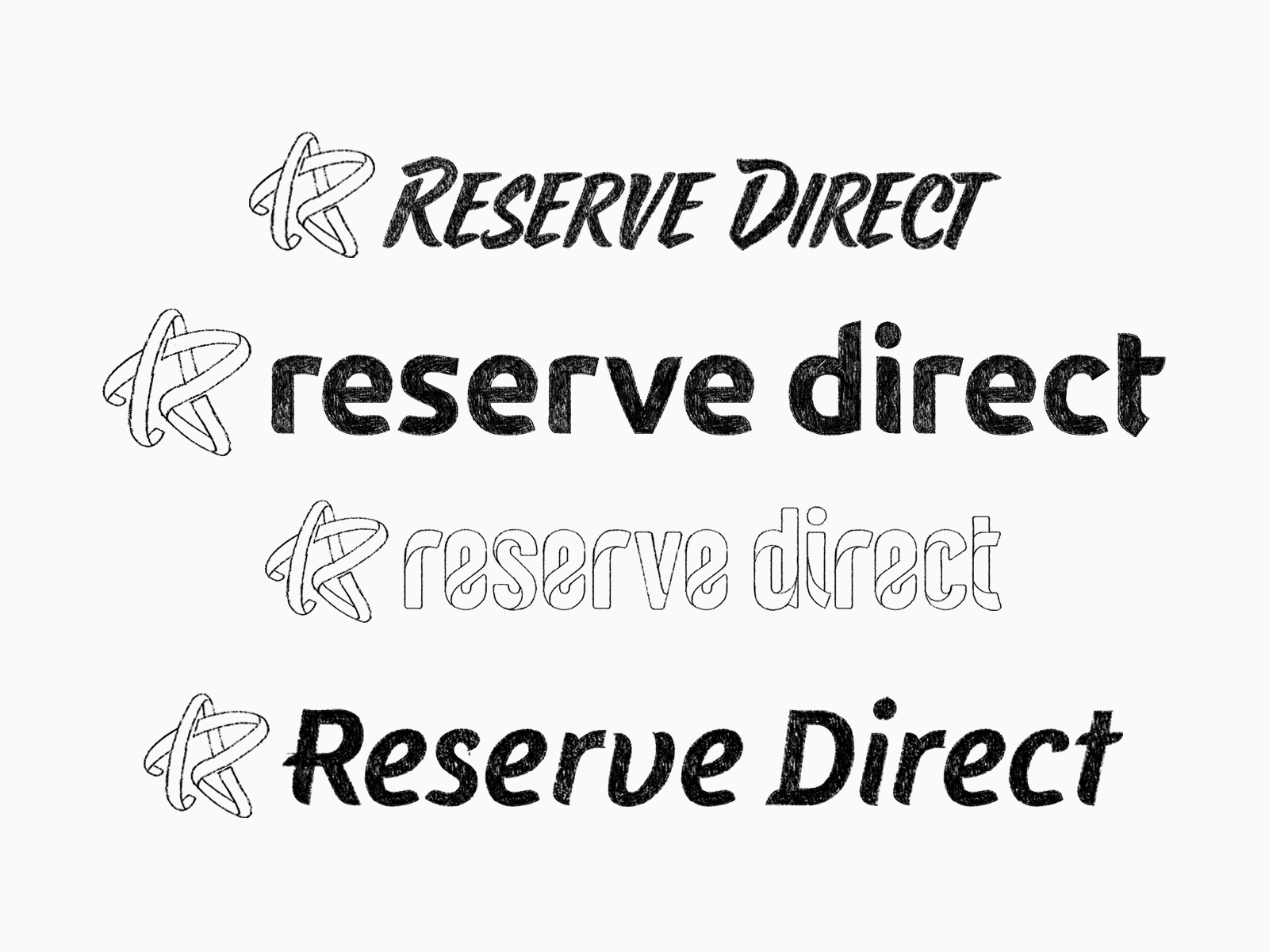
The Reserve Direct team wanted to see a range of disparate type styles, so I created 15 distinct concepts over 3 rounds of sketching. There was a rather quick timetable for the project, so instead of creating everything from scratch, I relied heavily on a technique I call "Frankentype." Frankentyping is a relatively quick way to achieve beautiful custom type. It takes a bit of trial and error, but the process is simple and flexible. Basically, I type a word using three to four different typefaces. Then, I turn the opacity way down and lay the different iterations over the top of one another. Finally, I look for lines, shapes, and curves that are interesting and make a rough outline before finishing up with a refining pass.
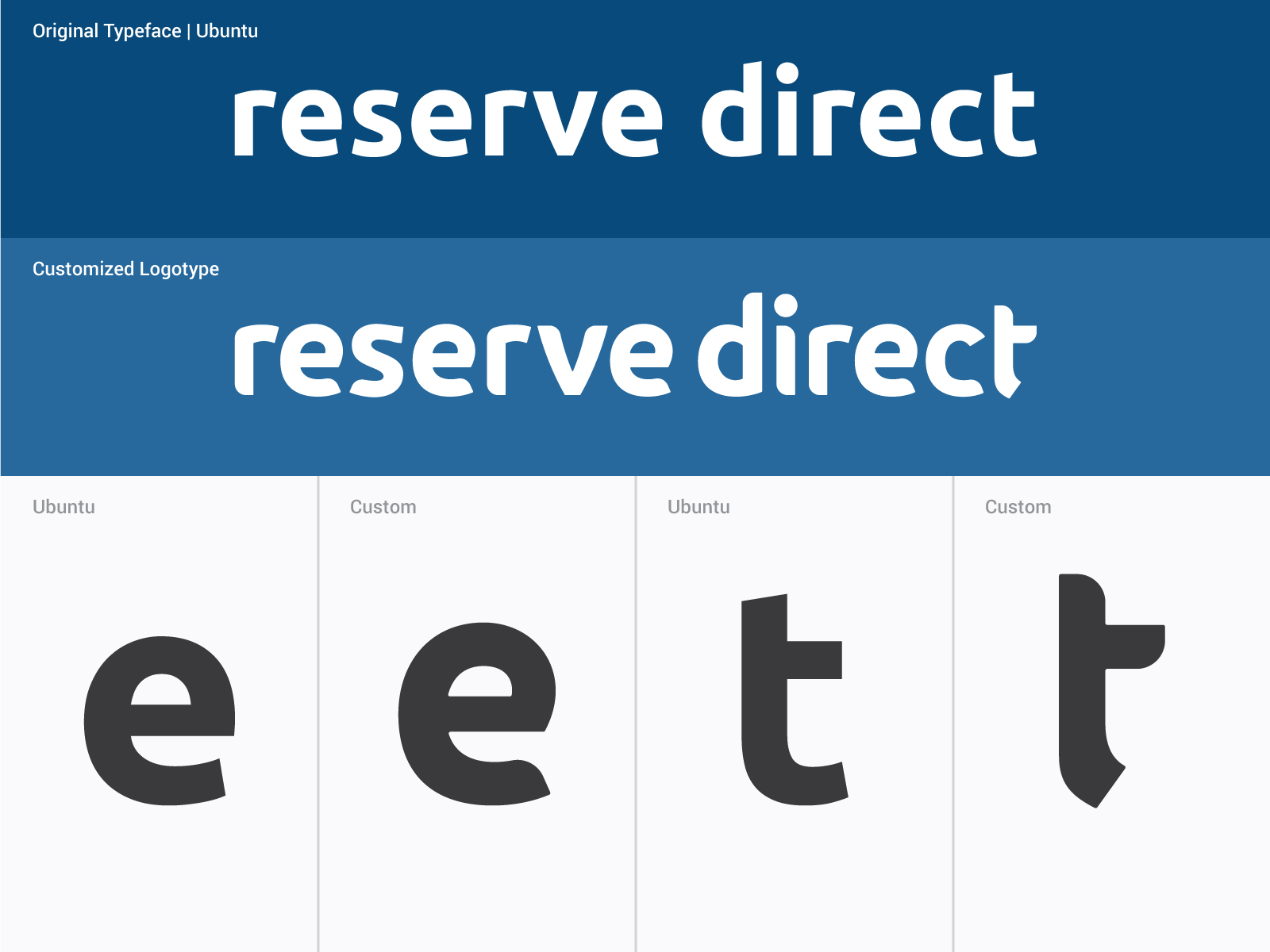
Customizing Ubuntu
Ubuntu, a typeface by Dalton Maag, has an interesting backstory and intriguing proportions, and it was one of the first typefaces I thought to reference for this project. To complement the expressive rhythm of the star mark, I decided the make the letterforms taller, rounder, and a bit softer in the corners.
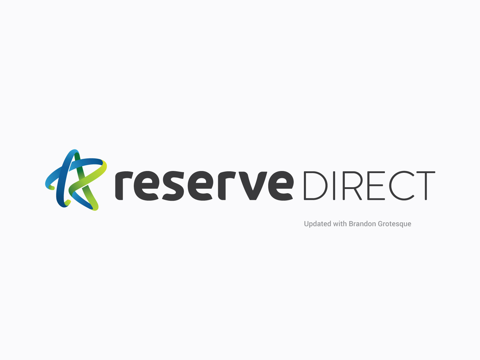
Introducing Brandon
After developing the custom logotype seen in the slide above, Kevin (RD's Marketing Director) felt like it was important to make a visual distinction between the words Reserve and Direct, with more emphasis going to Reserve because of its importance to the naming convention. Enter Brandon Grotesque, a rather slick typeface that the team at Reserve Direct suggested. The pairing was effortless.
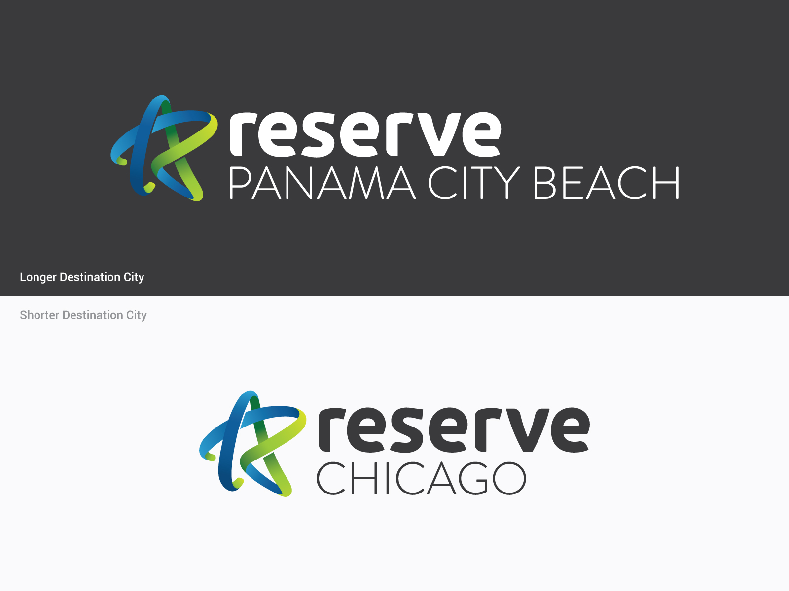
Destination Cities
Reserve Direct specializes in providing in-depth advice for 17 regional tourism destinations, and each destination city has its own online "storefront" that potential customers interact with. When online visitors access these city-specific storefronts, the naming convention changes, so Reserve Direct becomes Reserve Chicago or Reserve Panama City beach. My biggest challenge was defining an appropriate scale relationship between each element in the logo, and allowing for the fact that the visual width of each destination city is different.
This was a project with a lot of complementary parts, each having its own purpose but also needing to peacefully exist within the logo system as a whole. The design I arrived at with the help of the Reserve Direct team is clean, contemporary, and most importantly, in line with the company's strategic brand vision.