Brand Identity & Illustrations for an Empathy Driven Workers' Comp Firm
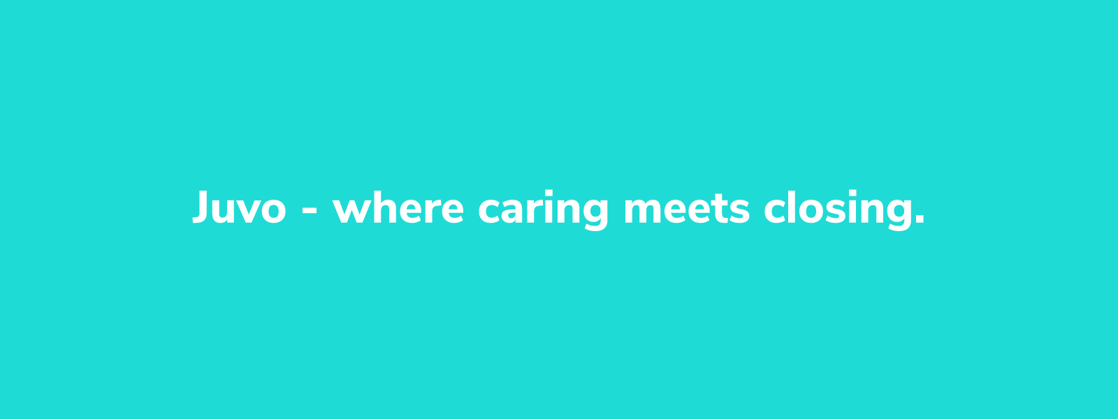
Juvo (wearejuvo.com) aims to reshape the entire workers’ compensation system for good. How? By humanizing the experience for injured workers and empowering claims teams with a streamlined process to closure.
I was commissioned to design:
A contemporary brand identity...
A set of easy-to-implement visual guidelines...
A brand messaging framework centered around compassion and innovation...
A set of friendly illustrations and engaging copy for Juvo's website.
Brand Identity
Juvo Logo Concepts
The Juvo brand is meant to convey empathy and healing. The workers' compensation process has a reputation for adding insult to injury by treating injured workers as cases to be closed rather than people to be helped.
With this in mind, the initial exploration of concepts focused on buoyant shapes and letterforms.
Healing Leaf
The name 'Juvo' stems from rejuvenation. Restoration of health and wellness are essential to the brand. For centuries, healers have relied on natural remedies from plant life, so the Juvo leaf, with its light and balanced structure, was an easy choice.

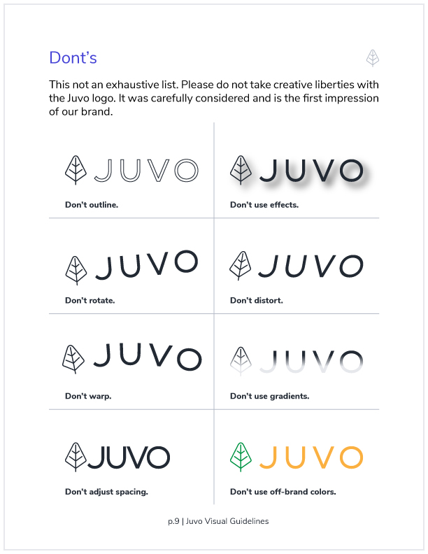
Custom Logotype
It was important for the Juvo logotype to read clearly and complement the leaf instead of overpowering it. The letterforms are clean, open, and effortless.
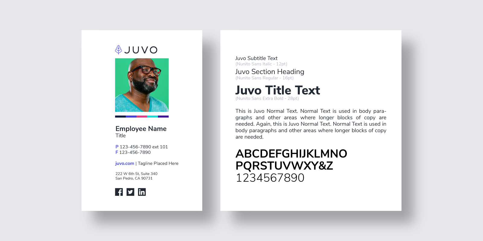
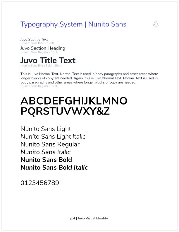
Website Typography Scheme
A web designer was waiting in the wings to implement my visual identity on the new Juvo website. The web typography scheme centers on Nunito Sans, a sans serif typeface with a wide range of widths and styles.
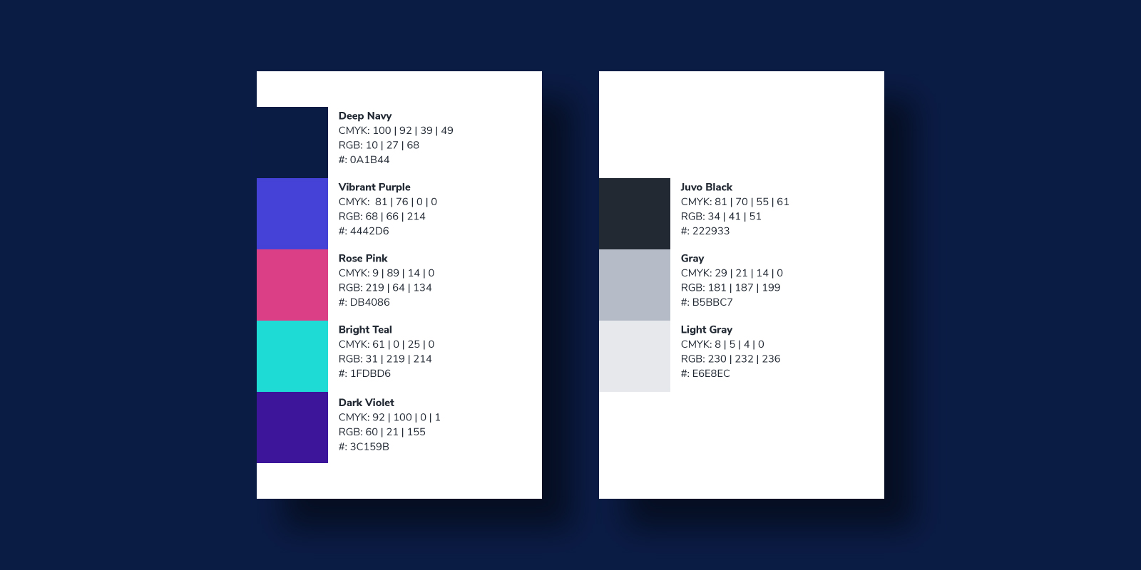
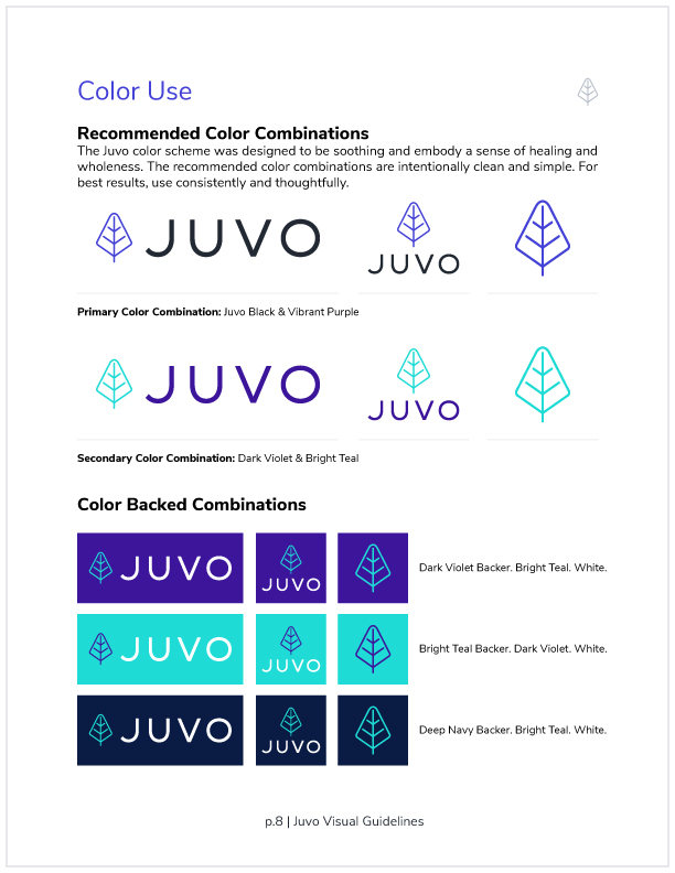
Brand Color Scheme
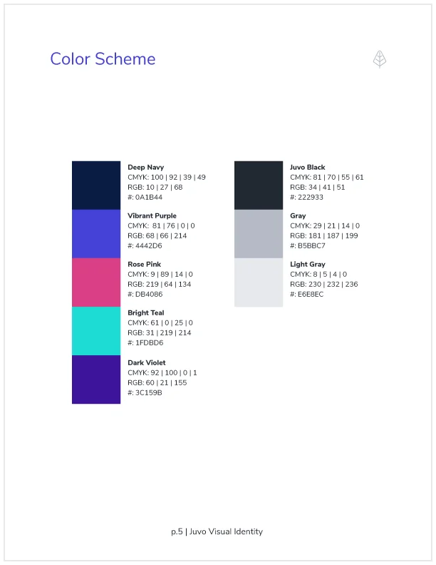
The Juvo brand color scheme is uplifting and high contrast, but its deep purples and soft accents create a calming mood that permeates the visual identity.
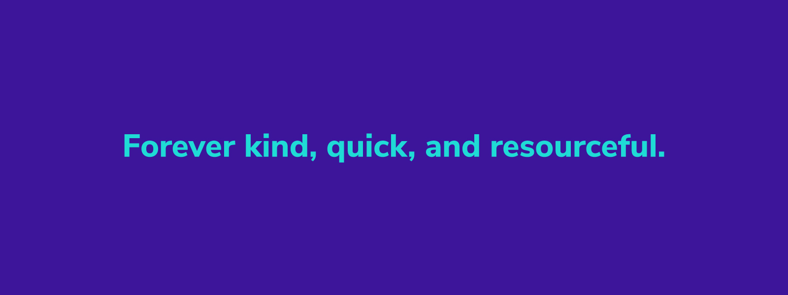
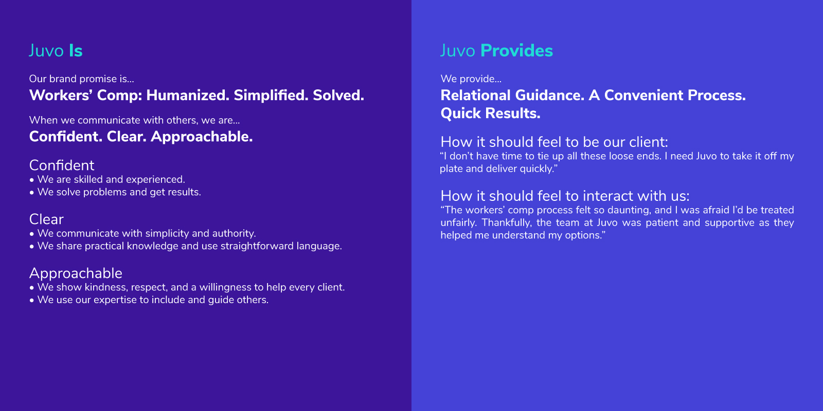
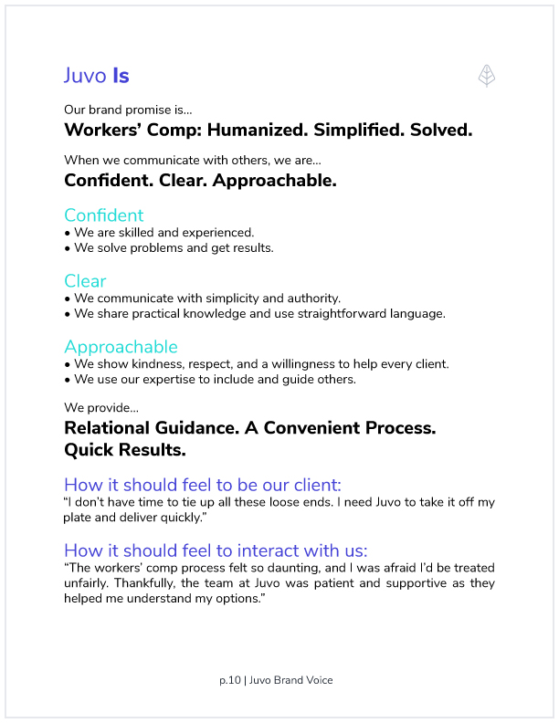
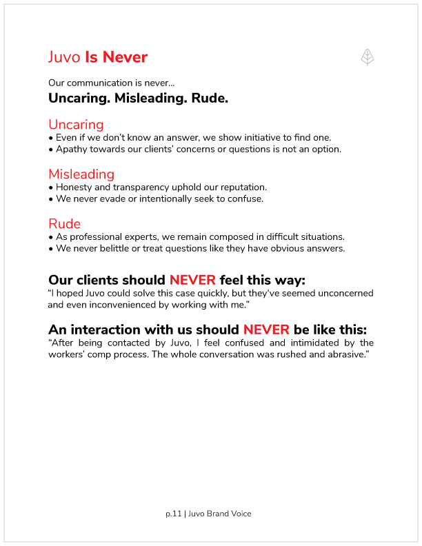
Juvo Brand Tone
Juvo's process is built on human-to-human interaction - it's part of what sets them apart in the workers' comp industry. With this in mind, I developed a concise set of guiding principles for Juvo reps to keep in mind when they're communicating with employers, claims adjusters, and injured workers.
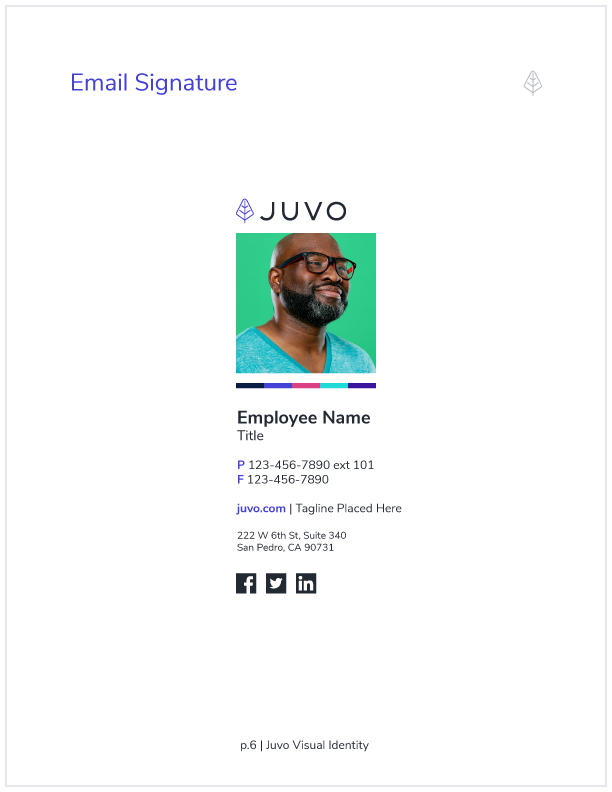
The Juvo Brand Identity
Brand cohesion is important. Everyone that represents Juvo in visuals, text, or spoken word needs to be on the same page, so I created an easy-to-use brand document that explains the most essential elements of the Juvo brand.
Illustrations & Website Copy
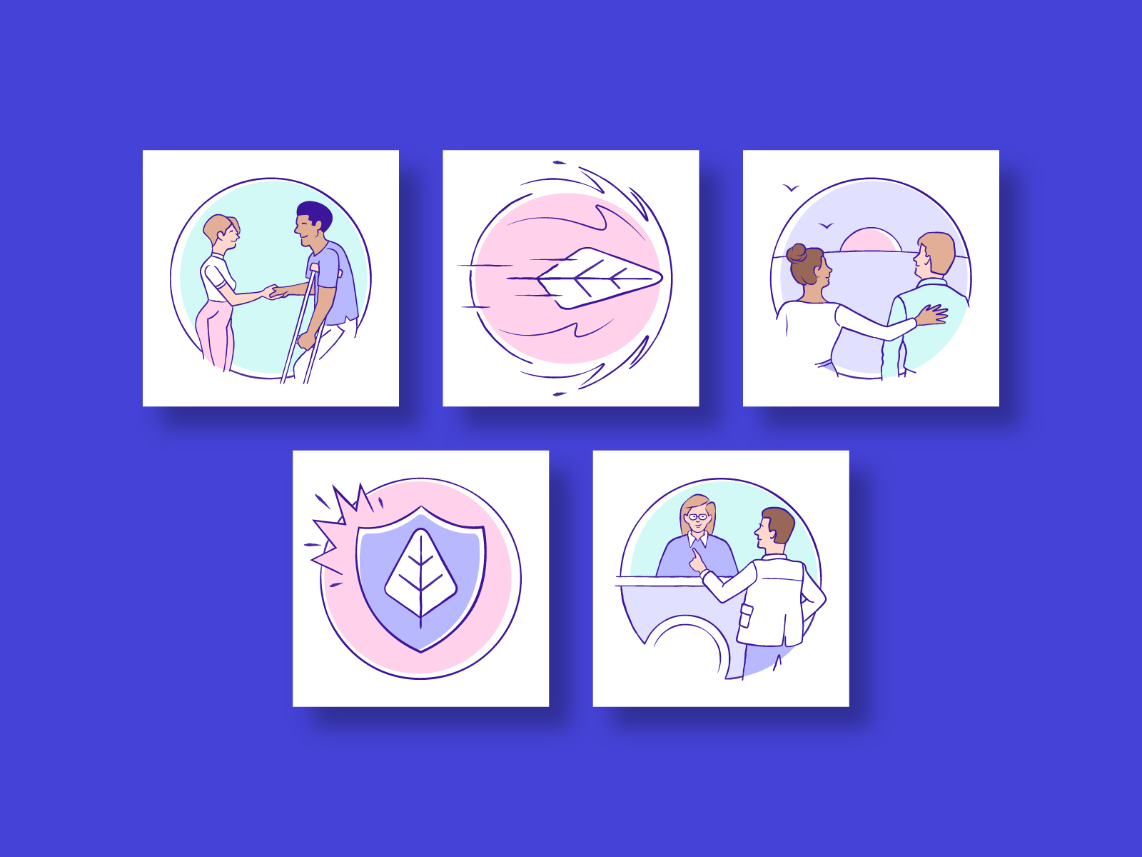
Brand Illustrations: Approachable & Human-Centered
Juvo CEO Jason Crow and I went back and forth on the value of brand illustration. At first, I proposed hiring a photographer to take candid shots of Juvo reps in action, but Jason had a hunch that illustration would add warmth and character to the brand.
With the Juvo leaf as my creative north, I delivered a series of eleven illustrations that added a human touch to Juvo's website copy.


Website Copy
In the workers' comp landscape, website copy is overly technical and packed with industry specific jargon. Because Juvo is welcoming and cares about injured workers, I opted for simple language that paints a clear picture of their innovative, people-first approach.